What is this tool?
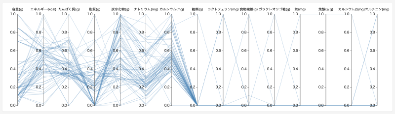
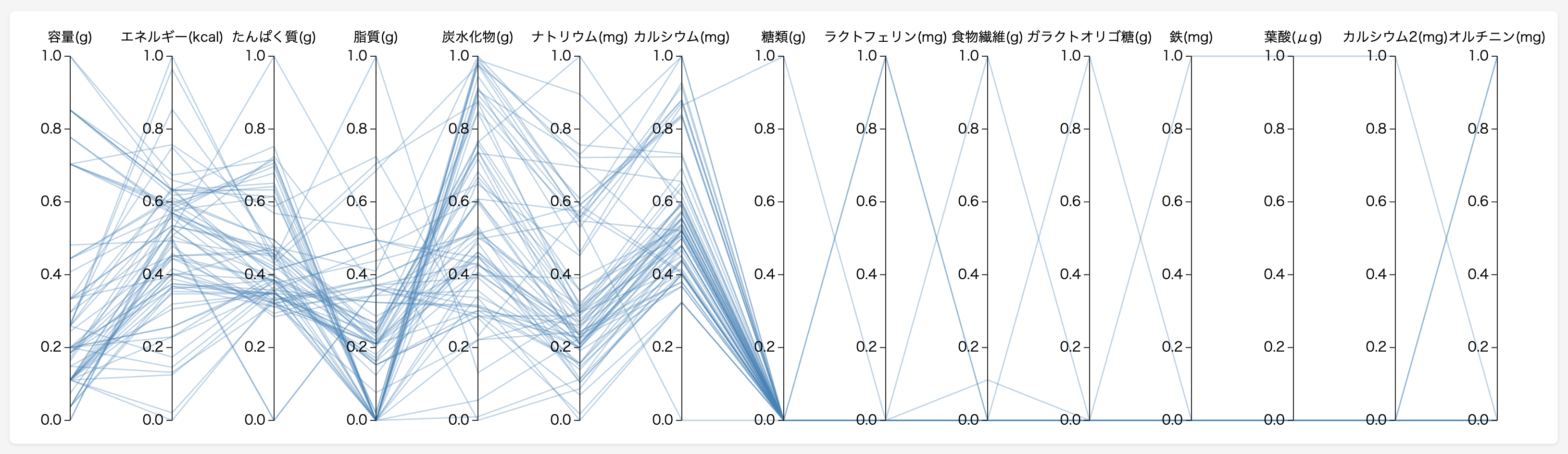
An interactive chart specialized for comparing and exploring multidimensional data. Simply upload a CSV file, and numeric columns are displayed as parallel axes with each row drawn as a polyline crossing them. Brushing on each axis lets you filter data matching specific conditions, making it easy to discover patterns and outliers intuitively.
Features
- Brushing: Drag vertically on each axis to specify a range and filter data matching the conditions
- Axis reordering: Drag column names horizontally to rearrange axis order. Place related metrics side by side for comparison
- Scale switching: Toggle between three modes — Original (raw values), Min-Max (0–1 normalization), and Z-Score (standardization)
- Table synchronization: The data table below syncs with brushing results. Hovering over a row highlights the corresponding line on the chart
- Export: Export filtered results as CSV and chart images as SVG/PNG
- Share — Share the current view via URL. OGP images for social media are generated automatically
- Project saving: Save and restore data and settings (scale, axis order, brush ranges) to the cloud with thumbnails
How to use
- Click “CSV Upload” to load your data (or try “Sample” to use yogurt nutrition data)
- Drag vertically on an axis to narrow down a range of interest
- Switch the Scale to Min-Max or Z-Score as needed to compare metrics with different units
- Drag axis names horizontally to place items you want to compare next to each other
- Hover over a table row to highlight the corresponding line on the chart
- Export results as CSV/SVG/PNG, or save as a project to the cloud
Data format
- File format: CSV (comma-separated, UTF-8)
- Structure: First row as header (column names), subsequent rows as data
- Numeric columns: Automatically detected and displayed as chart axes
- String columns: Shown in the table but not included as chart axes
- Missing values: Empty cells are treated as missing